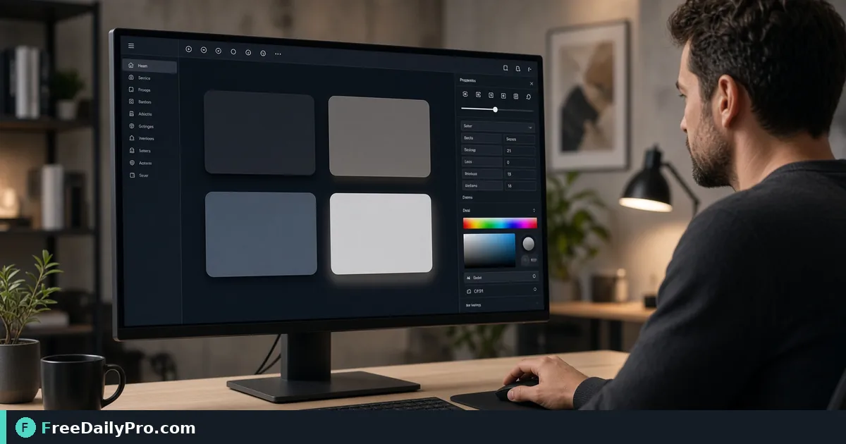
Two Box Shadow Tokens for Cards and Dropdowns, Built by Eye
Tune offset, blur, spread and opacity with a live preview, then copy one CSS box-shadow line for a card and a tighter dropdown.
Open any design system and you will find the same two problems in the shadow column: a card that looks like it is hovering a foot above the page, and a dropdown whose shadow is so faint the menu seems to bleed into the content behind it. The Box Shadow Generator lets you drag sliders, watch a sample card react, and copy a finished box-shadow line when it looks right.
The quick version: you set horizontal and vertical offset, blur, spread, a colour and an opacity, optionally switch on Inset, and the tool prints one CSS declaration. Everything runs in your browser, so nothing about your design is sent anywhere. The clip below shows the sliders in action.

What the sliders really control
The tool exposes five sliders and a colour swatch. Offset X and Offset Y run from -50 to 50 pixels and move the shadow sideways and downward. Blur runs from 0 to 100 and decides how soft the edge is. Spread, from -50 to 50, grows or shrinks the shadow before blurring. Opacity is a percentage from 0 to 100, and the colour picker sets the base hue. The output always has the shape offsetX offsetY blur spread rgba(r, g, b, alpha).
The starting values are 0, 4, 12, 0 and black at 20 percent, which gives the standard "soft lift" shape. That is a fine place to begin, but black at 20 percent tends to look grey and dirty on a white page, which is why the example below tints the shadow instead.
Worked example: a card token and a dropdown token
Say you are setting up elevation for a dashboard with a white page and a slate-blue text colour. You want two tokens: one for resting cards, one for floating menus.
For the card, aim for a shadow that is long and quiet. Set Offset X to 0, Offset Y to 8, Blur to 24, Spread to -4 and Opacity to 12. For the colour, use a dark slate such as #0f172a, which is rgb(15, 23, 42). The tool prints box-shadow: 0px 8px 24px -4px rgba(15, 23, 42, 0.12);. The negative spread pulls the shadow in from the sides so it reads as coming from underneath rather than glowing all round the card.
For the dropdown, the element is smaller and sits closer to the thing that opened it, so the shadow should be tighter and a touch stronger. Try Offset Y 4, Blur 12, Spread 0, Opacity 18 with the same slate colour: 0px 4px 12px 0px rgba(15, 23, 42, 0.18). Put the two previews side by side in your head: the card is wide and airy, the dropdown is crisp. That contrast is what tells a user which surface is the temporary one.
Steps in the tool
- Open the tool and leave the sample card in the preview pane. It is a plain bordered card, so judge the shadow against a light surface first.
- Choose the colour before anything else. Pick a dark tint of your brand or text colour rather than pure black. If you only have a hex from a brand guide, convert it to see its rgb parts with the Color Converter, because the output is written in rgba.
- Set the vertical offset. Real light comes from above, so use a positive Y and keep X at 0 unless you are deliberately styling a side-lit panel.
- Raise blur until the edge disappears into the background, then back it off a little. A good rule is that blur is roughly two to three times the vertical offset.
- Use spread to correct the shape. Slightly negative spread tightens a long shadow, positive spread makes a hard outline-like ring.
- Lower opacity last. Most shadows that look wrong are simply too dark, so drop it in steps of 2 or 3 points and watch the preview.
- Press Copy CSS and paste the line into your stylesheet or token file. Name the two tokens by purpose, such as
--shadow-cardand--shadow-menu, not by pixel values.
Mistakes that make shadows look cheap
The most common one is pure black at high opacity. Even at 30 percent it turns the area under the element into a grey smudge. The tool's own tip says the same thing: low opacity and moderate blur read as more modern than big, dark, sharp edges.
Another is changing blur but forgetting spread. When the shadow shows at the left and right of a card as a visible halo, you probably have a positive spread or a large blur with no negative spread to offset it. Pull Spread to -4 or -8 and the halo tucks away.
A third is judging on the wrong background. The preview card sits on the page background of the tool, which is light in the default theme. If your product has a dark mode, a black shadow nearly vanishes against a dark surface, so you will usually need either a higher opacity or a different elevation cue such as a lighter surface colour. Test the pasted CSS in the real dark theme, not just in the generator.
Lastly, remember that Inset flips the shadow to the inside of the box. It is useful for pressed buttons and text inputs, but it is easy to leave it ticked and then wonder why a card looks hollow.
What one slider set cannot do
The generator writes a single shadow layer. Many polished interfaces stack two or three, for example a tight contact shadow plus a wide ambient one, separated by commas. You can build each layer here, copy it, and combine them by hand: paste the first line, then add the values of the second after a comma, keeping the final semicolon. Always check the stacked result in your own page, because the preview only shows the layer currently on screen.
The tool also does not produce drop-shadow filters for images with transparency. A box-shadow follows the rectangular box of the element, not the shape of a transparent PNG. If you need the shadow to hug a rounded corner, set the corner radius first with the Border Radius Generator, because the shadow follows the radius.
Where it fits in a bigger design pass
Shadows rarely live alone. A card with a gradient header benefits from a quick look at the Gradient Generator, and the rest of the family sits in the design tools category. You get 10 trial usages a day, so settle your colour and rough offsets on paper, then spend a run on the final copy.
Quick questions
How do I know the shadow is subtle enough? Squint at the preview. If you notice the shadow before you notice the card content, lower opacity.
Should every card on the page share one shadow? Yes, within one level of elevation. Use the second token only for surfaces that float above the first, like menus, popovers and modals.
Can I use the output in CSS-in-JS? Yes. The value is a normal CSS string, so wrap it in quotes in an object style or paste it into a template literal.
Which surface is still stuck with a default shadow in your project, the cards, the menus or the modals? Tell us on the contact page.