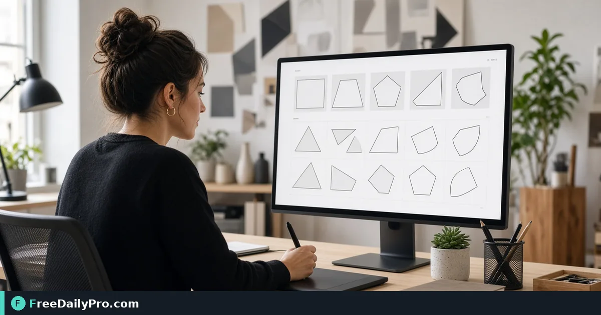
Slanted Hero Edges and Hexagon Photos with CSS Clip-Path
Pick a preset or click out your own polygon, copy the clip-path line, and know why shapes stretch on wide or tall elements.
A landing page with three flat rectangles stacked on top of each other looks like a form, not a campaign. The usual fix is to cut one of them at an angle, turn a team photo into a hexagon, or give a promotional card a speech-bubble outline. All of that is one CSS property, but writing the percentages by hand means guessing and refreshing. The CSS Clip-Path Generator shows the shape on a sample element and gives you the exact line to copy.
The tool works in the browser and nothing you click is sent anywhere. The clip below shows the preset buttons and the custom point builder.

Two modes, sixteen presets
Preset Shapes has sixteen buttons: Triangle, Trapezoid, Parallelogram, Pentagon, Hexagon, Octagon, Star, Cross, Arrow, Diamond, Circle, Ellipse, Message Bubble, Blob 1, Blob 2 and Diagonal Section. Circle and Ellipse use the circle() and ellipse() functions, and the other fourteen use polygon(). Click one and the sample square beside the buttons takes that outline, while the CSS line underneath updates.
Build Your Own is for anything else. You click inside a dashed grid to drop corner points one after another around the outline. Lines connect them, and a dashed line closes the shape once you have three. Undo Point removes the last click and Clear All starts over. You cannot drag a point after placing it.
Worked example: a slanted hero banner
Say the hero banner on a campaign page is 1440 pixels wide and 600 tall, and you want the bottom edge to rise slightly on the right. Click Diagonal Section. The tool gives clip-path: polygon(0% 0%, 100% 0%, 100% 85%, 0% 100%);.
Read it as four corners: top-left, top-right, a bottom-right corner at 85 percent of the height, and the bottom-left corner at the full height. On a 600 pixel banner, 85 percent is 510 pixels, so the right edge is 90 pixels shorter than the left. Across 1440 pixels, that is a gentle slope of about 3.6 degrees.
Now look at the same banner on a phone, 390 pixels wide and still 600 tall. The percentages are unchanged, so the drop is still 90 pixels, but over 390 pixels it is about 13 degrees. The cut looks much steeper. If that feels too aggressive on mobile, set a smaller height on small screens or override the polygon in a media query with a value like polygon(0% 0%, 100% 0%, 100% 92%, 0% 100%), which drops the right edge by 48 pixels at 600 high.
Steps for a preset shape
- Choose Preset Shapes and click the shape you want.
- Check the preview. It is a fixed 192 pixel square filled with a gradient, not your own image, so judge the outline and not the colours.
- Press Copy CSS. You get one declaration, for example
clip-path: polygon(25% 0%, 75% 0%, 100% 50%, 75% 100%, 25% 100%, 0% 50%);for the Hexagon. - Paste it on the element you want to cut, such as an image, a card or a section.
- Give that element the dimensions it will really have, then look at it in the browser. Percentages refer to the element's own box.
- Adjust any point by editing the numbers in your stylesheet. The generator will not edit a pasted value, but each coordinate is a plain percentage you can nudge.
Drawing a custom shape
Imagine a promotional badge shaped like a ticket with one clipped corner. In Build Your Own, click the top-left corner, then the top-right, then work around: a point at the right edge 70 percent down, one at 85 percent across the bottom, bottom-left, and back up the left side. You need at least three points before the preview and the CSS appear, and the output rounds each coordinate to one decimal place, such as 12.5% 40.0%.
Order matters. Place points around the outline, clockwise or counter-clockwise, rather than jumping across the shape, or the edges cross and you get a bow-tie. If one point in the middle is wrong, undo back to it, or clear and redraw. Clicking near the edges is fine, because points are clamped to the box between 0 and 100 percent.
Things that surprise people
Clip-path crops; it does not resize. The part of your image outside the shape is simply hidden, so a portrait photo cut into a hexagon may lose the top of a head if the subject sits near the edge. Use a source image larger than the element, and check faces.
A shadow on the same element is clipped as well. If you put a box-shadow on a hexagon, the shadow is cut away with the rest. The usual workaround is to put the shadow on a parent wrapper, using a filter: drop-shadow(...) rather than box-shadow, so it follows the clipped outline. You can design the softness first with the Box Shadow Generator and translate the numbers.
The two Blob presets are many-sided polygons, not smooth curves. At small sizes they read as organic shapes, but on a very large element you may see straight segments. For curves, rounded corners or a path() outline, an SVG editor suits better. For simple rounded rectangles, the Border Radius Generator is the right tool.
The clipped area also stops receiving clicks, so a button with a cut corner will not respond to a tap in that corner.
Pairing with fills and layout
Shapes look better with a considered fill. Try a gradient behind the clipped section from the Gradient Generator, and see our post on box-shadow tokens for cards for elevation. Other layout helpers sit in the design tools category. You have 10 trial usages a day.
Test the final result on a narrow phone, a laptop and a very wide monitor before it ships, because one polygon applied to three different aspect ratios gives three different angles.
Which shape do you reach for most on landing pages, and what would you want the builder to do next? Tell us on the contact page.