One-Page Flyer for a Pottery Open Day: Print, PDF and Bleed
Build a single-page flyer with a headline, key points, a QR image and contact line, then export it as image, Letter PDF or print-shop PDF with bleed.
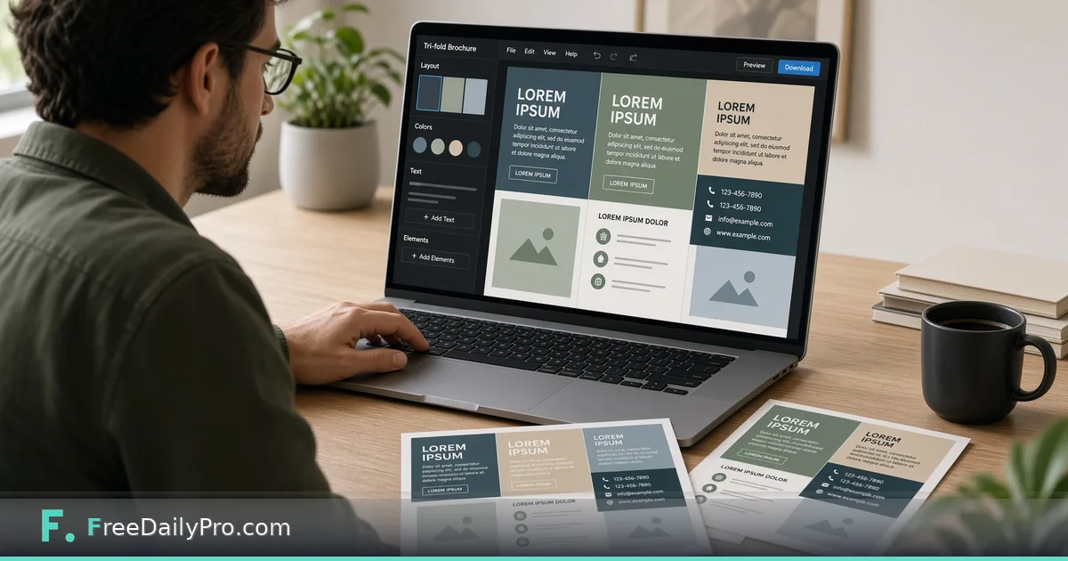
A neighbourhood pottery studio is holding a Saturday open day and needs a flyer for the noticeboard, the cafe window and a shared group chat, all by Thursday. Opening a layout program and fighting with grids is more than the job needs. Brochure & Flyer Maker gives you one page with a coloured header, a list of key points and a contact line, and four ways to get it out.
In short: fill the text fields, pick one of six accent colours, add a header photo or image blocks if you want them, check the live preview beside the form, then choose the export that matches where the flyer is going.

What the layout gives you, and what it does not
The page has a fixed structure. The top band shows the business name in small capitals, a large headline and a subheadline over the accent colour or a photo. Below sit your key points, each with a coloured dot, and a centred contact line at the bottom. You cannot move blocks around, change fonts or add a second column, which is why it is quick.
The six accent colours are indigo, green, red, amber, purple and teal. An optional header photo is stretched across the top band, and a dark overlay is added automatically so white text stays readable whatever the photo contains. Key points can be text lines or whole image blocks, and image blocks are capped in height so one big picture does not push the rest off the page.
Writing the content for the studio
Say the studio is called Lakeside Clay Works. The headline reads "Saturday Clay Day: Try the Wheel", and the subheadline says "Drop in between 10 and 4, no experience needed." The first key point is the one a passer-by must see even if they read nothing else: "Saturday 20 June, 10:00 to 16:00". The next three are "Wheel taster, 25 per person, materials included", "Kids' hand-building table from 11:00" and "Bring an apron; we supply the clay". The contact line holds an address and a booking email.
Putting the date and time first follows the tool's own advice: a flyer gets a few seconds of attention, so the most important message must be seen right away. Resist adding a fifth and sixth point. When a bullet needs a full sentence of explanation, it belongs on the website.
Steps in the tool, in the order of the form
- Type the Business Name, Headline and Subheadline. The preview on the right updates as you type.
- Pick an Accent Color.
- Optionally drop a Header Background Photo. A Remove button clears it.
- Edit the Key Points. Use Add Point for more text lines, Add Image for a picture block, and the bin icon to delete one.
- Enter the Contact Info line, such as an email, phone number and web address separated by bullets.
- Choose an export from the four buttons.
For the studio, a QR code that links to the booking page fits as an image block. Make the code with QR Generator, save it as an image, then use Add Image. Test it with a phone camera from the screen before you print anything.
The four exports and when to use each
Print / Save as PDF opens your browser's print dialog with only the flyer visible and a 0.5 inch margin. This suits the office printer and lets you pick a paper size such as A4. Download as Image saves a PNG sized for about 300 pixels per inch at 8.5 inches wide, which is right for a chat message or a social post.
Download as PDF (Letter) places the flyer on a Letter page inside a 0.5 inch margin. It is a picture of the design, so the text inside cannot be selected or searched, and a web address on the flyer will not be clickable. Print-shop PDF is for a professional printer: enter the finished width in inches (between 2 and 24), and the page becomes that size plus 0.125 inch of bleed on every side, with the design extended into the bleed so no white sliver appears after cutting.
Bleed and safe margins in plain terms
Bleed is extra artwork beyond the cut line, so a tiny misalignment at the guillotine does not leave a white edge. The tool's own note says to keep text at least 0.25 inch inside the edge. With a coloured header that runs to the edge, that is worth checking on the preview: if the business name sits tight against the top-left corner, shorten it.
Ask the print shop for their requirements before you pay for a run. The file is built from an on-screen design, and shops differ on colour mode, bleed and resolution.
Common mistakes
Leaving the sample text in place is the one most people regret, because the default business name, headline and contact line are plausible enough to be overlooked. Read the live preview from top to bottom as if you had never seen it. Another is a photo with a bright, busy area behind the headline; the overlay helps but cannot rescue a cluttered image, so pick a calmer picture.
A third is using a contact line that wraps badly. Keep it to one or two short items. And check the QR scan on a phone at the size you will actually print; a code the size of a postage stamp may fail at arm's length.
When a different tool fits better
For a big format sign, Banner & Sign Maker is built for large single messages. For something people can slip into a wallet after talking to you at the stall, use Business Card. The guide to menu, invitation and print design tools covers the other print layouts, and you can browse the marketing design tools category for more.
Privacy
The layout is built in your browser, and photos you add are read on your device rather than uploaded. If an export fails, the page suggests trying the print dialog or the image download instead.
Which flyer would you make first: a sale, an event or a recruitment notice? Tell us on the contact page so we can write the next example around it.