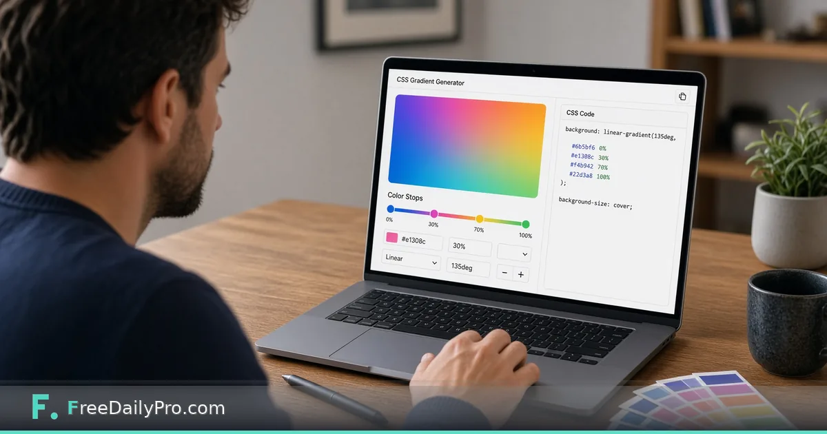
Build a Three-Stop CSS Gradient for a Landing Page Hero
Create a linear, radial or conic CSS gradient with up to six stops, copy the code, and check text contrast before shipping.
Say you are building a landing page for a fictional analytics product and the design calls for a deep navy hero that fades into sky blue. A photographic background would add a heavy image to the first screen. A CSS gradient is a single line of code, so it loads with the page itself. Gradient Generator lets you shape that line visually and copy it out.
Pick two to six colors, choose linear, radial or conic, set an angle, and the preview above the controls redraws as you go. The clip below walks through the controls.

Start with the controls as they actually behave
Two color boxes are on screen at the start, indigo and pink, running at 135 degrees. Each color has a picker and a percentage box underneath, which is the position of that stop along the gradient line from 0 to 100. Pressing Add Color brings in a new cyan stop, up to a maximum of six, and an X button next to each stop removes it as long as at least two remain.
One behavior deserves a warning. Every time you add or remove a color, all positions are re-spaced evenly: three stops land at 0, 50 and 100, four at 0, 33, 67 and 100, six at 0, 20, 40, 60, 80 and 100. Any custom positions you typed before are overwritten. So add every color first, then adjust the percentages last.
The three type buttons produce different CSS. Linear uses the angle slider from 0 to 360 degrees, where 90 runs left to right and 180 runs top to bottom. Conic sweeps around a center point and uses the same slider to rotate the start. Radial always starts in the center and spreads out in a circle; the slider disappears because the angle does nothing there.
Build the hero: a worked example
The goal is navy to blue to sky. Add one extra color so you have three, then set them like this:
- Color 1
#0f172aat 0 percent, the deep navy. - Color 2
#1e3a8aat 55 percent, a royal blue that holds the middle. - Color 3
#38bdf8at 100 percent, the sky blue. - Type linear, angle 160, so the line runs almost straight down with a slight lean.
The code box then shows linear-gradient(160deg, #0f172a 0%, #1e3a8a 55%, #38bdf8 100%), about 62 characters. Switch the type to radial and the same stops become radial-gradient(circle at center, ...), which puts navy in the middle and sky at the rim, usually a poor fit for a headline sitting in the center.
Press Copy CSS. The clipboard receives two lines: first a plain background: declaration using the first stop's color, and then the gradient. That first line is a fallback for a browser that cannot draw a gradient, so paste both lines together.
Check the text on top before shipping
A gradient makes contrast uneven, because the color behind a word depends on where the word sits. White text on the navy end measures about 17.85 to 1, and on the royal blue about 10.4 to 1, both comfortable. White text on the sky end measures about 2.14 to 1, which most people will struggle to read.
The practical answer is placement: because 160 degrees runs from top to bottom, keep the headline and subhead in the top half, and put an image, illustration or dark-text button where the sky color is. Dark navy text on the sky blue measures about 8.3 to 1. Test your own pairs with Contrast Checker rather than judging by eye, and try each stop, not just the two ends.
If you were given brand colors as RGB or HSL values, convert them to hex first with Color Converter, since the color pickers here work with hex values.
Gradients that are not smooth on purpose
Two stops at the same position create a hard edge. Set four colors with the first two the same amber at 0 and 50 percent, the last two the same red at 50 and 100, and the angle at 90. The result is linear-gradient(90deg, #f59e0b 0%, #f59e0b 50%, #ef4444 50%, #ef4444 100%), a clean two-tone split with no blend, useful for banners and section dividers.
A conic gradient becomes a seamless color wheel when the first and last stops match. For example, amber at 0, red at 50 and amber at 100 gives conic-gradient(from 90deg at 50% 50%, ...), a loop with no visible seam. Use it for chart rings, loaders or decorative badges.
Gradients between close shades are quiet and professional. Gradients between hues far apart, like yellow and blue, often pass through a dull gray-green in the middle. If that happens, add a third stop in a color you picked on purpose.
Mistakes to watch for
- Adding a color after you tuned the positions. The re-spacing wipes your numbers.
- Trusting the angle on a radial gradient. It has no effect, so leave the slider alone there.
- Forgetting there is no transparency. The pickers choose solid colors, so a fade to transparent has to be edited by hand in the CSS afterward.
- Judging contrast only at the top left. Scroll the preview mentally to every place text will land.
- Using a long, busy gradient for a full-width hero without a plan for small screens. Test it narrow, because a steep 160-degree gradient stretches differently on a phone than on a wide monitor.
What the tool does not do
It creates one gradient at a time and has no export to a stylesheet, no named presets and no saved palettes. It does not add noise or grain to reduce banding. Nothing is saved between visits, so copy the CSS before you leave the page.
Next step
Open Gradient Generator, rebuild the navy-to-sky example in about a minute, and then swap in your own brand colors. Related tools live in the design tools category.
Which background are you trying to replace with a gradient, a hero, a button, or a card? Tell us on the contact page.