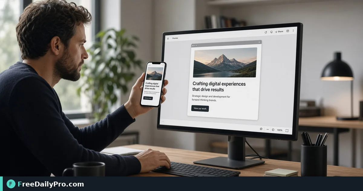
Put a UI Screenshot Into a Phone, Tablet or Browser Frame
Frame an app or web screenshot in a device mockup, control what the crop keeps, and export a PNG for a pitch deck without design software.
A raw screenshot dropped onto a slide looks like a screenshot. The same image inside a phone outline looks like a product. For a pitch deck, a landing page or a client update, that small shift is worth five minutes, and you do not need design software to get it. Mockup Generator places an image into one of three frames, a browser window, a phone or a tablet, and exports a PNG.
The clip below shows the frame picker and the download.

What the three frames actually do
Browser Window draws a grey title bar with red, amber and green dots above your image. The frame is sized to the picture: the PNG is always 1200 pixels wide and the height follows your image's proportions plus 44 pixels for the bar. A 1440 by 900 desktop screenshot becomes 1200 by 794 (750 for the image plus 44), and nothing is cropped.
Phone is a dark rounded body with a notch, exported at 600 by 1220 pixels. The screen area inside the bezel is 552 by 1172. Tablet is a dark body with a plain bezel at 900 by 1200 pixels, with an 820 by 1120 screen. Both fix the screen shape, so your image is cropped to fill it, and that is where most of the decisions live.
Worked example: a phone screenshot and a dashboard
Start with a 1170 by 2532 phone screenshot. The tool scales it to cover the screen, which makes it 552 pixels wide and about 1,195 tall. Only about 23 pixels, a little under 2 percent of the height, is trimmed, so a tall phone screenshot fits almost exactly and needs no adjusting.
Now try a 1920 by 1080 dashboard in the same Phone frame. Cover scaling has to fill 1,172 pixels of height, so the image becomes about 2,084 pixels wide and the screen shows only around 26 percent of it, a narrow slice. You have three options:
- Drag the image sideways to choose the slice that matters, and use the Zoom slider (1.0x to 2.5x) if needed.
- Click Fit whole image. The picture shrinks until it is entirely visible, roughly 552 by 310 pixels, and white fills the leftover space above and below. Everything shows, but it looks small.
- Click Rotate to turn the source 90 degrees. The dashboard becomes 1080 by 1920 and covers the screen at about 84 percent of its width, so a short drag picks the portion you want.
For a wide chart, the better move is usually to switch to the Browser Window frame, where the whole picture is shown without cropping.
Steps in the tool
- Drop a screenshot or design onto the zone. Any common image type works; the work happens in your browser.
- Choose Browser Window, Phone or Tablet.
- For Phone or Tablet, drag the picture to choose what stays on screen, adjust Zoom, and decide whether to tick Fit whole image.
- Use Rotate if the source is the wrong way round. Each press adds 90 degrees (0, 90, 180, 270) and resets any drag and zoom.
- Click Download Mockup (PNG). The file is named after the frame, such as mockup-phone.png.
Switching frames also resets your position. Choose the frame first, then fine-tune. Reset Position puts the drag and zoom back without changing the frame.
Picking source images that survive the crop
Frame choice is easier when the source matches the shape. A mobile-app screen suits Phone, a tablet layout suits Tablet, and a desktop page suits Browser Window. If you only have a desktop screenshot for a mobile pitch, capture the mobile view again instead of cropping. Screenshot Capture & Editor can help with the capture, and Resize & Crop can trim a screenshot to a better shape before it goes in.
Resolution matters too. The frames export at fixed sizes, so a small source image is enlarged and looks soft. A 600 pixel wide screenshot placed in the Browser frame is stretched to double its width. Capture at a higher density, or choose a smaller frame.
Common mistakes
- Trying to drag a picture in the Browser Window frame. There is nothing to reposition there, since the frame follows the image. Drag, Zoom and Fit apply to Phone and Tablet only.
- Leaving an automatic crop that cuts off the navigation bar or the call-to-action button. Check the top and bottom edges before you download.
- Expecting the browser frame to show a web address. It has the title bar and the three dots, with no address bar, so add the URL in your slide text if it matters.
- Forgetting the white fill. Fit whole image paints white around the picture, which can look odd on a dark slide; give the slide a light panel behind the mockup, or avoid Fit for dark UIs.
- Using a huge file. A PNG with a fixed frame can still be large; run it through Compress Image if the deck needs to stay email-sized.
- Using a logo or product that is not yours. Mockups are for your own work or work you are authorised to show.
What to do after the export
Place the PNG on a slide or page with a plain background, and keep the same frame style across a set so a deck looks consistent. If you need a Phone and a Browser view side by side, create both, then put them on one slide at the same height. The mockup is a flat PNG, so you cannot change the screen content later; keep the source screenshot and re-export when the design changes.
The tool is a quick presentation aid, not a replacement for a full design suite: no device colours, no shadows and no angled perspective. For many pitch decks and landing pages, a clean frame is all the polish the screenshot needs. More options sit in the design tools category.
Which view do you mock up most, mobile app screens or desktop pages? Tell us what you would like next on the contact page.